What is Fluid Engine? Should you use it?

Squarespace 7.1 has a radically improved drag-and-drop editor called “Fluid Engine”. It is currently available on English-language Squarespace 7.1 websites, with other 7.1 sites following in the Autumn.
For the last ten years we have all been using “Layout Engine”—a 12-column grid that let you drag and drop widgets and resize them relative to each other. This was extremely easy to use, especially for beginners and non-designers, but this also limited the possibilities.
Fluid Engine has a 24-column grid so customizable you can even control the gap between each cell, letting you segment your screen as you wish. The resulting experience can best be described as “fluid” (hence the name). New features include:
“Mobile-first” designs
Easy resizing of images
Easy full bleed content
Layering of blocks
Backgrounds on blocks
“Layout Engine” has been rebranded as the “Classic” editor and is still available.
If you have an English-language Squarespace 7.1 site you can start using FE straight away by adding a new section to a page. You’ll see a host of new layout options, or you can start with a blank one. If you don’t have a Squarespace 7.1 site yet, you can start a free trial!
Using Fluid Engine
Unbreakable Creativity
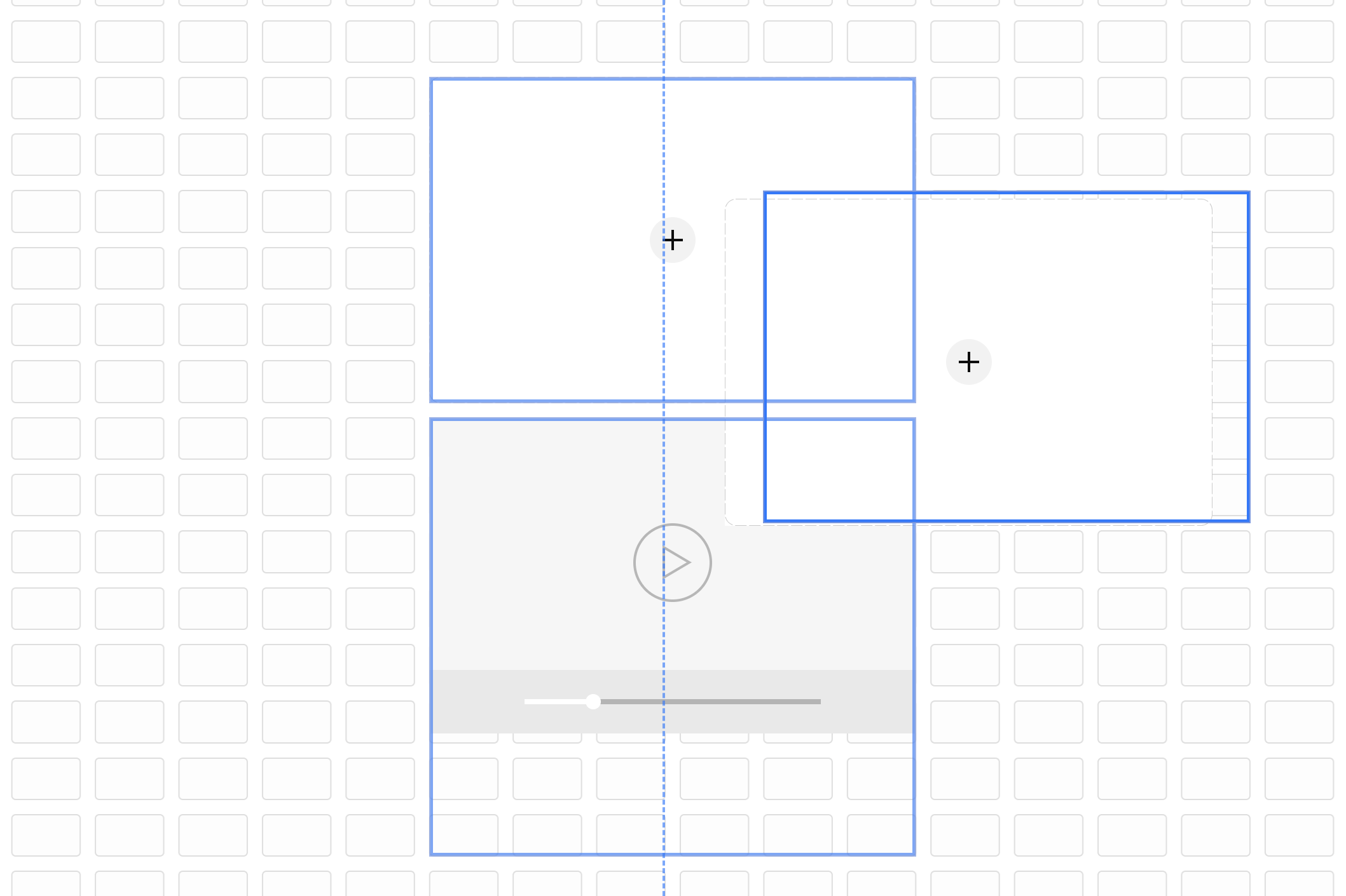
Moving blocks on the new Fluid Engine grid
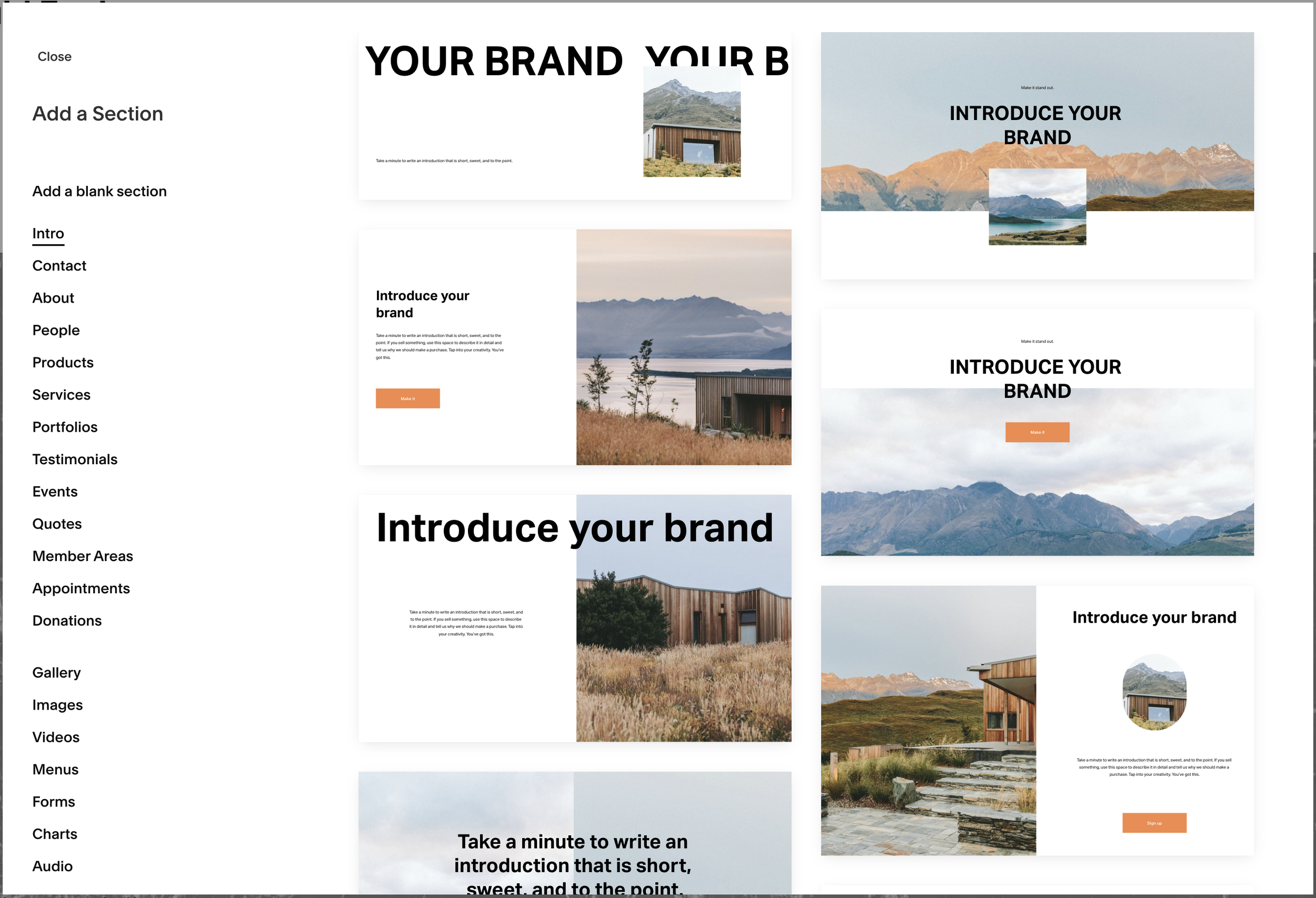
New section layouts available with Fluid Engine
The first things you’ll notice when you add a new section is the grid. If you don’t see it, press the ‘G’ key on your keyboard.
What’s great?
Fluid Engine allows you to create layouts that were impossible before. You can overlap elements and layer them in any order.
You can drag the size and shape of images using Image Blocks, and they don’t “blow up” to full width on mobile like they used to!
Many Blocks now have content alignment options allowing you to align the content within the block.
You can set a background colour on many Blocks
Scalable text is available, adjusting to match the size of the Block.
You can design the mobile layout independently of the desktop layout. Yes, really! The mobile layout can be adjusted however you like!
You can use Fluid Engine on any new section and you can convert existing sections to Fluid Engine too!
You can continue to create Classic sections and use the Classic editor to edit them.
A range of new Section Layouts are now available.
What’s missing?
With this new flexibility comes a new way to design webpage layouts on Squarespace. You’ll want to put some time aside to learn this new tool.
Image Blocks added to Fluid Engine sections don't have the classic editor layouts like Inline, Poster, Card, Overlap, Collage and Stack. Instead, you can create similar layouts by overlapping Image Blocks with other blocks, like text blocks and Button `Blocks. These will not be added later.
Image Blocks don’t have captions, and they won’t be added later. You can add a caption with a Text Block.
Text wrapping (the ability to wrap large blocks of text around images) isn’t available on Fluid Engine yet, but they’re hoping to introduce this in the Autumn.
I hope you find this free resource helpful. Please take a look at our range of Squarespace add-ons to improve your website’s usability.
Paul
Squarespace Extensions for Squarespace 7.1