Top CSS tweaks for Squarespace 7.1
Even if you’ve building Squarespace 7.0 sites for years, when you start using Squarespace 7.1 you may be surprised at how inflexible it can seem to be. Popular Squarespace 7.0 templates like the Brine-family had a Site Styles panel that was stuffed with hundreds of tweaks to change almost everything. Squarespace 7.1 is a little different, preferring to keep things ‘locked down’ so that DIY users can’t ‘hurt themselves’. Many of the settings from the previous generation of sites are either missing or scattered in many different panels.
So here are my top tweaks for Squarespace 7.1. Each tweak includes some styling text known as CSS. You can paste this into your Custom CSS panel, separating each CSS “snippet” with a new line. You’ll find the Custom CSS panel in Design > Custom CSS.
1. Remove automatic hyphenation
Unless you love seeing hyphens (single dashes) throughout your headings and your body text, this setting will be essential for all your websites. It prevents Squarespace splitting larger words when they don’t fit the width available on different devices. This CSS will cause the word to wrap onto the next line without breaking into two.
/**************************************
No hyphens solution - sf.digital
Use freely in your CSS. Do not re-post.
**************************************/
p, h1, h2, h3, h4 {
-webkit-hyphens: manual !important;
-moz-hyphens: manual !important;
-ms-hyphens: manual !important;
hyphens: manual !important;
}
2. Remove link underlining in the footer
We all love underlined hyperlinks in the body of our websites because it makes them easy to find and improves usability.
For consistency, Squarespace also underlines navigation links in footers too! However, everyone knows that the header navigation links and footer navigation links are clickable, so it doesn’t make sense for footer hyperlinks to be underlined. They must go!
You can remove the footer underlines by adding this Custom CSS:
/**************************************
No footer underlining fix
Copyright SF.DIGITAL https://sf.digital
Use freely in your Custom CSS but
do NOT re-publish.
**************************************/
footer a {
  text-decoration: none !important;
}
3. Unwanted horizontal scrolling
When you’ve added some custom code that moves an element, or adds a third party element (like a booking form) then you’ve probably found that there’s some extra space on the right side of your website, especially when you view it on a mobile. As you scroll down the page, you may find that you can also scroll to the right (into empty space) and back again. This additional space is called “overflow”.
To avoid this issue, it’s a good idea to check through your code and find the source of the problem. It’s always better to fix the source of the problem than to workaround it. However, that’s not always easy or possible, so here’s a workaround to hide the overflow:
/**************************************
Hide the horizontal overflow
**************************************/
html { overflow-x: hidden; }
4. Correct the ‘Add to Cart’ button height
On Squarespace 7.1, you can choose from one of four Product Detail Page (PDP) layouts. The four layouts are as follows:


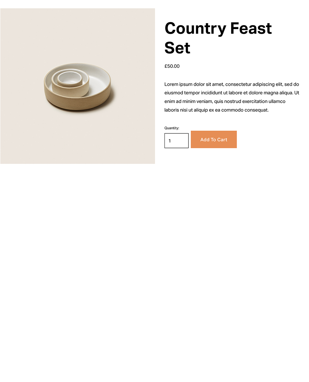

The Simple layout was the only layout available until December 2021. Confusingly the ‘Simple’ layout is the most customisable of the available layouts! It includes tweaks in Site Styles that allow you to adjust it.
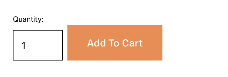
In contrast, the newer product layouts - Full, Half and Wrap - are very stylish but the layouts have been fixed to prevent you making changes. Ordinarily this wouldn’t be a problem but Squarespace introduced a bug in March 2022 that makes the ‘Add to Cart’ button the wrong height!
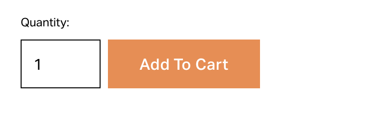
This is something you’ll want to fix because on these newer layouts, the ‘Add to Cart’ button sits alongside the quantity selector and so you’d expect the button to be the same height.
The button should look like this:
But it actually looks like this:
You can correct this with a few simple lines of CSS:
/**************************************
Cart button height fix   (c) sf.digital
Use freely in your CSS. Do not re-post.
**************************************/
.pdp-layout .sqs-add-to-cart-button.sqs-button-element--primary {
  padding-top: 0em!important;
  padding-bottom: 0em!important;
}
5. Styling for different devices
If you’re adding CSS to your Squarespace 7.1 website, you will often want some styles to only affect a specific screen width. For example, you may want to add some CSS to style the page banner on mobile devices, the position of an element on a tablet device, or the header navigation on a desktop computer.
You can of course use media queries to do this, but I often find that users add the same media query multiple times, making the CSS difficult to follow, and leading to problems with some lines of CSS that conflict with existing CSS.
The solution is to create a “template” of media queries for popular device sizes, and then add your CSS “within” this template. For example, take a look at the following CSS. As it stands, this template won’t make any changes to your site but it defines three different screen widths (more correctly called “viewpoints”) for mobiles, tablets and desktop.
It states that a mobile device is any device with a maximum width of 799 pixels, a tablet is any device between 800 and 1024 pixels, and a desktop is all devices with a larger viewport.
/**************************************
Define device breakpoints
**************************************/

@mobile: ~"only screen and (max-width: 799px)";
@tablet: ~"only screen and (min-width: 800px) and (max-width: 1024px)";
@desktop: ~"only screen and (min-width: 1025px)";

/* Desktop */
@media@desktop {

}

/* Tablet */
@media@tablet {

}

/* Mobile */
@media@mobile {

}
If you have some CSS that you only want to use on mobile devices, you’ll want to paste it into the last section under @media@mobile, between the curly braces. If you place the code in the tablet section, it will only apply to tablets, and so on.