Add mobile CTA footer to Squarespace
This guide explains how to add a call-to-action (CTA) bar to mobile devices on the latest version of Squarespace.
The bar contains up to two CTA buttons and will remain “sticky” (fixed to the bottom of the mobile browser) encouraging the user to take one of the actions. It can optionally disappear as the user scrolls down, saving valuable screen space for browsing long or infinite scrolling pages that were popularised by social media platforms like Instagram and Pinterest.
Isn’t there a built-in mobile information bar?
Before explaining how to add this to your Squarespace website, I should probably mention that Squarespace already has a built in mobile information bar.
This feature has been available since Squarespace 6 and is still available on current Squarespace 7.0 and 7.1 templates but is no longer very popular. I imagine this is because the bar’s design has not kept pace with other website elements and looks very dated with small icons and labels that don’t always translate well (see screenshots below).

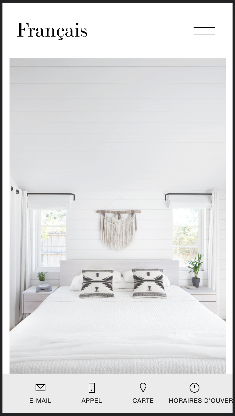
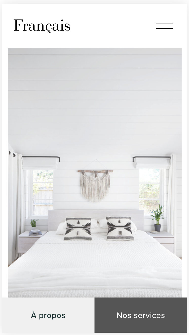
However, it may also be unpopular because of the lack of flexibility. You can have any colour as long as it’s white on black or black on grey, and it can only link to the following four areas:
Email - Opens an email to your email address
Call - Prompts a call to your phone number
Map - Opens a map with a pin on your location
Hours - Opens your business hours and shows if your business is currently open or closed
Good UX (user experience) Principles
Despite the limitations of the built-in mobile information bar, it does demonstrate the benefits of offering clear CTAs to mobile users, and it follows a number of good UX principles.
It is “sticky”, allowing users to take action wherever they scroll.
It can disappear as the user continues to scroll downwards, saving valuable screen space but reappearing whenever the user scrolls upwards.
The buttons are placed at the bottom of the mobile screen. This helps because most users start by scanning the content and then their eyes move from the top half of the screen towards the bottom. When the content ends, they’re looking for a call to action, so by placing call to action buttons at the bottom, users can get to them faster.
Placing CTA buttons at the bottom has the added advantage of allowing them to be sized for easy tapping. Placing them at the top would not only go against the user’s natural scanning flow, it would require a smaller button size - and potentially awkward placement - as they’d need to share space with the site title and nav link.
The buttons are aligned side-by-side horizontally which causes users to view them as a “set” and give equal consideration to both. That said, it is usually best to place the primary action on the right as this generally results in faster task completion. This is because the user’s eye usually moves diagonally from left to right until it reaches the bottom-right corner where this button is located. This is known as “reading gravity”.
Adding the CTA Bar
This guide explains how to add the CTA bar to your Squarespace website using the default settings shown in the screenshot above. It is a very straightforward process where you “copy & paste” some code into your site and then save the changes.
When you have followed steps 1 and 2, you will have two new buttons on the mobile version of your website, with the default captions, links and colours.
In steps 3 and 4 you will make some small changes to customise the buttons to meet your needs. You will:
Customise the colours of the caption and background for each button
Change the button captions
Edit the button links so that when users tap them, they are sent to the correct pages on your site
Step 1: Adding the code
This first step adds some HTML that creates the CTA bar and the two buttons, and some JavaScript that hides them during downward scrolling.
1.1. Whilst logged on to your Squarespace website, navigate to Settings > Advanced > Code Injection.
1.2. Paste the following into the first panel labelled “HEADER”:
<!-- Mobile CTA Bar for Squarespace 7.1 ---------------------------------------------------->
<!-- Copyright Soundfocus Digital Media [https://sf.digital] ------------------------------->
<!-- Use freely in your code injection. Do NOT re-publish. --------------------------------->
<div class="sf-mobile-cta-wrapper">
  <div class="sf-mobile-cta">
    <div class="sf-mobile-cta-btn sqs-block-button-container">
      <a href="/about" class="sqs-block-button-element--large sqs-button-element--secondary sqs-block-button-element">À propos</a>
    </div>
    <div class="sf-mobile-cta-btn sqs-block-button-container">
      <a href="/services" class="sqs-block-button-element--large sqs-button-element--secondary sqs-block-button-element">Nos services</a>
    </div>
  </div>
</div>
<style>
.sf-mobile-cta-wrapper {
  display:none;
}
</style>
<script>
(function() {
  var sfPrvScrPos = window.pageYOffset;
  window.onscroll = function() {
    var sfCurScrPos = window.pageYOffset;
    console.log (sfCurScrPos);
    if (sfPrvScrPos < sfCurScrPos && sfCurScrPos > 15) {
      document.querySelector(".sf-mobile-cta-wrapper").style.bottom = "-84px";
    } else {
      document.querySelector(".sf-mobile-cta-wrapper").style.bottom = "0";
    }
    sfPrvScrPos = sfCurScrPos;
  }
})();
</script>
<!-- End of Mobile CTA Bar for Squarespace 7.1 --------------------------------------------->
1.3. Save the changes.
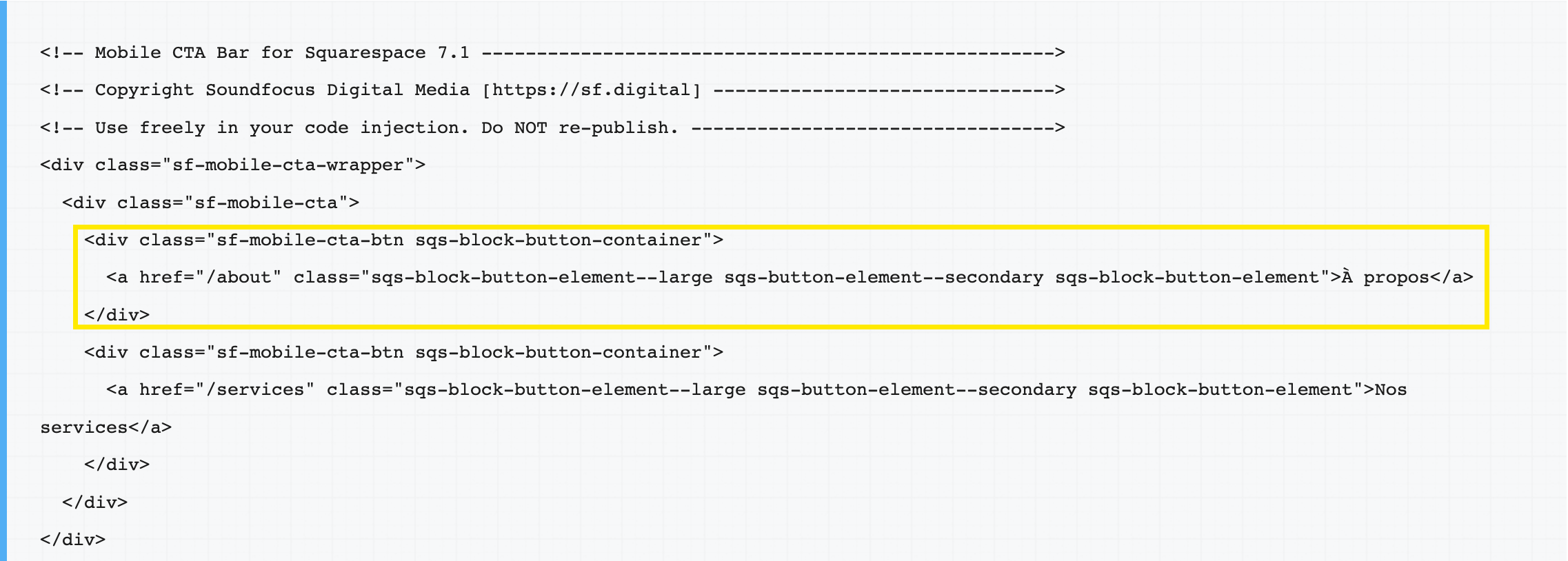
If you’d only like one button instead of two, you can delete the section highlighted in yellow below and save the changes:
Step 2: Adding the CSS:
This second step adds the styling information that will determine how the buttons are styled, including the colours of the button captions and background. For now, add the CSS exactly as it is shown. I will explain how to customise it in step 3.
2.1. Whilst logged on to your Squarespace website, navigate to Design > Custom CSS.
2.2. Paste the following CSS into the panel:
/* Mobile CTA bar - Squarespace 7.1   */
/* Copyright Soundfocus Digital Media */
/* Further info: https://sf.digital   */
/* Use freely in your Custom CSS      */
/* Do not copy or republish           */

/* Left (secondary) button colours */
.sf-mobile-cta-btn:nth-of-type(1) {
  background-color: #F0F0F0;
  color: #193837;
}

/* Right (primary) button colours */
.sf-mobile-cta-btn:nth-of-type(2) {
  background-color: #555;
  color: #fff;
}

@media only screen and (max-width:800px) and (orientation: portrait) {
  .sf-mobile-cta-wrapper {
    display: block!important;
  }
}

.sf-mobile-cta-wrapper {
  background: #ebebeb;
  bottom: 0;
  left: 0;
  position: fixed;
  width: 100%;
  z-index: 10;
  transition: bottom .3s;
}
.sf-mobile-cta {
  display: flex;
  flex-direction: row;
  align-content: center;
  justify-content: center;
}
.sf-mobile-cta-btn {
  flex-grow:1;
  flex-basis: 0;
  text-align: center;
}
/* End of navigation hover effect    */
2.3. Save the changes.
Now that you’ve added all the code, you should see two buttons when you view your site on a mobile device or using the mobile preview. As shown in the video at the top of this page, they should temporarily slide out of the way when scrolling down a page and then reappear if you scroll up.
Step 3: Customising the button colours
The button colours can be changed by editing the Custom CSS panel that you found in Design > Custom CSS. There are settings for two colours on each of the buttons, as shown below:
/* Left (secondary) button colours */
.sf-mobile-cta-btn:nth-of-type(1) {
  background-color: #F0F0F0;
  color: #193837;
}

/* Right (primary) button colours */
.sf-mobile-cta-btn:nth-of-type(2) {
  background-color: #555;
  color: #fff;
}
Each colour is represented by a colour code consisting of a hash (#) character and a hexadecimal code, for example #fff for white or #000 for black. The colour codes are often defined in a site’s colour palette but you can also create them by using a tool like htmlcolorcodes.com.
Each button has a pair of colour values: a background-color value that defines the colour of the button, as well as a color value that sets the colour of the button’s caption. For example, for the first button to have a white caption on a black background, you could set the values like this:
/* Left (secondary) button colours */
.sf-mobile-cta-btn:nth-of-type(1) {
  background-color: #000;
  color: #fff;
}
Don’t forget to save your changes by clicking Save at the top of the Custom CSS panel!
Step 4: Customising the button captions and links
The last two changes can be made in Settings > Advanced > Code Injection > HEADER. Look for this section:

When clicked, the button will send the user to a specific URL. This required URL should be placed in double quotes as shown above. The links are shown in the two yellow boxes on the left. They currently point to the About and Services pages.
The captions for the two buttons have been highlighted in yellow boxes on the right. You can change these captions to meet your needs, but do keep them short so they fit on a single line on each button.
You’ll need to click Save to save these changes before they will be visible in the preview pane or on the website.
You should now have two CTA buttons on the mobile version of your Squarespace website.
I hope you find this free resource helpful. Please take a look at our range of Squarespace add-ons to further improve your website’s usability.
Paul
Squarespace Extensions for Squarespace