How to Style the Squarespace Cart Popover (“Mini-Cart”)
When a customer adds a product to their cart, Squarespace can display a small confirmation popover.
Squarespace calls this the Mini Cart, although I've never been entirely convinced that's the best name for it because it doesn't show the contents of the cart, just the item that was most recently added. Personally, I'd have called it the Added to Cart popover, but perhaps that's just me!
Introduced in March 2026, it addresses a genuine usability issue on Squarespace. Previously, the only indication that a product had been added to the cart was a subtle animation on the Add to Cart button. It was easy to miss, leaving customers wondering whether anything had actually happened. The new popup provides immediate feedback and offers quick access to the cart or checkout, creating a much clearer shopping experience.
Unfortunately, if you've tried to customise its appearance, you've probably discovered that its styling isn't controlled in an obvious way! It’s more than a little confusing 😵💫 and can lead to some odd colour combinations:
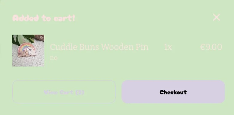
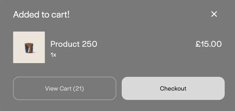
How Squarespace decides the colours
As things stand today, the Mini Cart doesn't have its own dedicated styling settings. Instead, its appearance is determined by the theme you’ve used for the first section on the page.
Yes, really.
If the first section on the page uses one of these light themes:
Lightest 1
Lightest 2
Light 1
Light 2
Bright 1
Bright 2
…the Mini Cart automatically uses the Dark 1 theme.
If the first section uses one of these dark themes:
Dark 1
Dark 2
Darkest 1
Darkest 2
…the Mini Cart switches to Light 1 instead.
In theory, you can customise the colours of those themes in Site Styles to influence the appearance of the Mini Cart but, in practice, it's not nearly that simple.
The Mini Cart only appears for a few seconds, making it awkward to preview while you're tweaking colours. On top of that, those same colour themes may already be used elsewhere on your website, so changing them to improve the Mini Cart could unintentionally affect other sections of your site.
A better approach
Personally, I'd love to see Squarespace take one of two approaches in the future.
The first would be to better explain how colour themes are intended to be used. They're designed as reusable design tokens rather than one-off colour combinations, but that's not always obvious to someone building their first website. A little more guidance could help self-builders create more consistent designs and avoid unexpected colour combinations when features like the Mini Cart inherit those themes.
Alternatively, Squarespace could simply provide dedicated colour options for the Mini Cart itself, allowing it to be styled independently of the page themes.
Custom CSS
Until then, using custom CSS will give you complete control over the Mini Cart without affecting the rest of your site's colour palette.
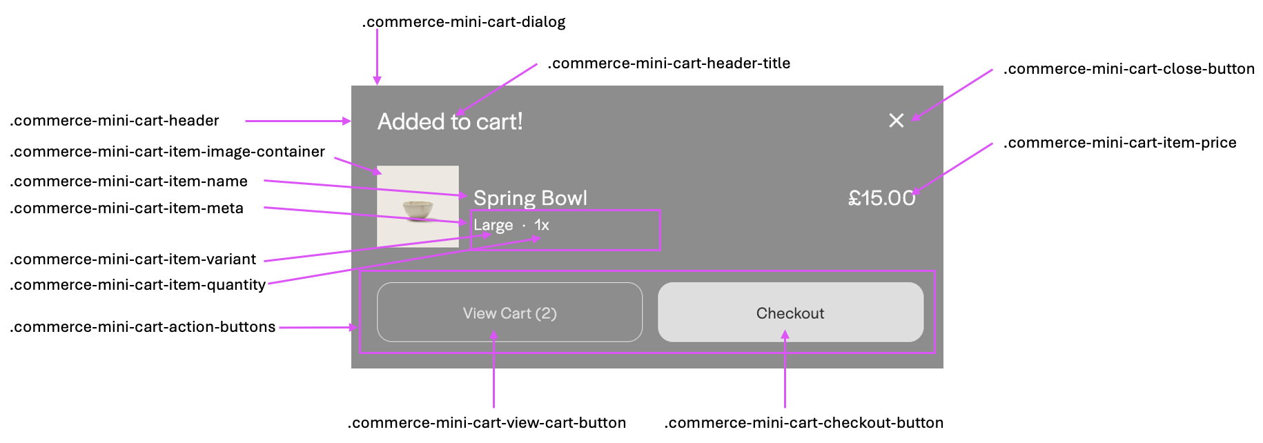
The example below creates a simple monochrome design with a white background, black text and black buttons. Use it as a starting point and customise the colours to suit your own brand and website design.
/* Mini cart styling */

/* background colour */
.commerce-mini-cart-dialog.open .commerce-mini-cart-dialog {
  background: #fff;
}

/* title colour */
.commerce-mini-cart-dialog .commerce-mini-cart-header .commerce-mini-cart-header-title span {
    color: #000;
}

/* colour of other text */
.commerce-mini-cart-dialog span * {
  color: #000!important;
}

/* style of horizontal divider */
.commerce-mini-cart-dialog .commerce-mini-cart-header {
  border-bottom: 1px solid #e5e5e5;
}

/* colour of product details */
.commerce-mini-cart-dialog .commerce-mini-cart-item-name,
.commerce-mini-cart-dialog .commerce-mini-cart-item-price, .commerce-mini-cart-dialog .commerce-mini-cart-item-details .commerce-mini-cart-item-info .commerce-mini-cart-item-meta .commerce-mini-cart-item-variant  {
  color: #000 !important;
}

/* checkout btn styling */
.commerce-mini-cart-dialog .commerce-mini-cart-action-buttons .commerce-mini-cart-checkout-button {
  background: #000;
  .commerce-mini-cart-button-text span {
    color: #fff!important;
  }
}

/* view cart btn styling */
.commerce-mini-cart-dialog .commerce-mini-cart-action-buttons .commerce-mini-cart-view-cart-button {
  color: #000;
  border: 1px solid #000;
}

/* close btn colour */
.commerce-mini-cart-dialog .commerce-mini-cart-header .commerce-mini-cart-close-button .commerce-mini-cart-close-icon {
  background-color: #000!important;
}

/* close btn focus style */
[data-sqsp-mini-cart="true"] .commerce-mini-cart-close-button:focus-visible {
  outline: 2px solid #000;
  outline-offset: 2px;
}
I’ve added some remarks to help you to understand how it works.