New button styling experience on 7.1
From 2 June 2022, button styling has been updated on Squarespace 7.1.
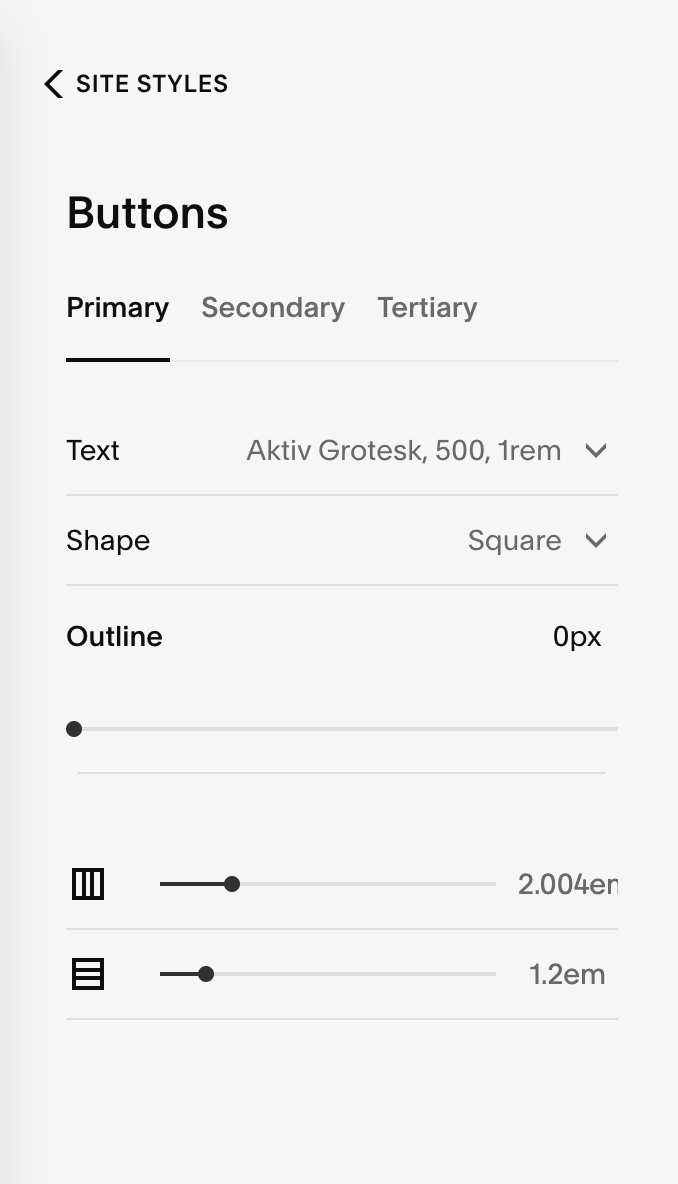
The Buttons panel now divides button styles into three types: Primary, Secondary, and Tertiary. Most buttons follow primary style settings, but you can vary the styles of button blocks throughout your site with secondary and tertiary settings.
You can set the following tweaks for each type:
Text - Set the font and font styles for buttons in that tier.
Shape - Set the shape and if the button has a color fill (Fill) or only an outline (No Fill).
Outline - Set the outline thickness of the button for No Fill buttons. On Fill buttons, changing the outline slider changes the padding outside the button.
Horizontal padding - Set the padding to the left and right of the button text.
Vertical padding - Set the padding above and below the button text.
This change does not affect Squarespace 7.0 sites. For more information see the Squarespace support article entitled Styling buttons.